How on earth did the Web end up in this mess?
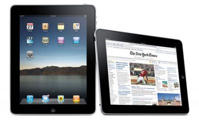
Always interested by new gadgets, I watched keenly as a friend demonstrated the features of their super-new Internet-enabled semi-mobile device.
It displayed a typical web page, but due to the limited size of the screen, the text could not be read. So they went on to explain that, using a finger movement, the page could ZOOM.
STOP RIGHT THERE !!!
We now have technology that, by design, displays stuff you cannot read?!
The longer I spend in this world the less it seems to make any sense!! Maybe I'm just getting old, my friend seemed to think this was a desirable feature!
If you can, change the size of your viewport. Using a computer, this means resizing the browser window (un-maximising [is that a word?] it if necessary). Now see how this page adjusts to fit the space available? Well that's how the web was originally intended to work.
Then came commerce, marketing, the dot-com boom, and a desire to light the web up like a Christmas Tree all in the name of selling stuff. Designers wanted control of the user experience forcing the web to look like printed pages of yesteryear. Then mobile devices arrived and the pages designed for a fixed size screen no longer fitted. So manufacturers invented the ZOOM function to deliberately force something that had been forced to be bigger to be smaller again. You keeping up?
Please stop this madness! The web should simply flow onto any device of any size. This is a call to all designers everywhere to use RESPONSIVE web design, the new word for making the web work like it should always have done.